Typography
Headings and subheadings invite and guide readers through the text. Effective use of large headings grabs their attention. Smaller subheadings help them decide whether or not they want to read a particular section. Headings need to stand out to help anchor the composition.
Base Size: 22px (137%/1.375em)
Scale: 1.250 Major Third
Design is not just what it looks like and feels like. Design its how it works.
The worst misstep one can make in design is to solve the wrong problem.
Creativity is allowing yourself to make mistakes. Design is knowing which ones to keep.
Typography serves as the foundation of clear communication, establishing hierarchy and guiding users through content with purposeful design choices.
Well-crafted typography creates seamless reading experiences that enhance comprehension and maintain user engagement throughout the interface.
Consistent typographic scales ensure harmony across all content, from headlines to body text, creating a cohesive visual language.
Strategic use of font sizes and weights helps users quickly scan and process information efficiently.
Fine print and captions require careful attention to maintain readability at smaller sizes.
- ✱Item List
- ✱Item List
- ✱Item List
- ✱Item List
- →Item List
- →Item List
- →Item List
- →Item List
Main Heading
"Make it count" sums up our whole approach. Whether we are looking at design, copywriting or illustrations, we are all about emotional triggers that lead to action.
Secondary Heading
This secondary heading introduces a new section with supporting content that explains the concepts in more detail.
Tertiary Heading
Tertiary headings break down the content further into digestible subsections for better readability.
- First item in the list
- Second item in the list
- Third item in the list
- Fourth item in the list
Sample text is being used as a placeholder for real text that is normally present. Sample text helps you understand how real text may look on your website. Sample text is being used as a placeholder for real text.
Colors
Headings and subheadings invite and guide readers through the text. Effective use of large headings grabs their attention. Smaller subheadings help them decide whether or not they want to read a particular section. Headings need to stand out to help anchor the composition.
bw-purple
#783bfa
bw-black
#0e0f11
bw-blue
#185bf6
bw-white
#ffffff
bw-red
#e11837
bw-green
#006347
bw-pink
#f9beff
bw-orange
#fb3e03
bw-light-gray
#d9d9d9
bw-medium-gray
#adaaad
bw-dark-gray
#5c595c
bw-lightest-gray
#f7f8f9
bw-off-white
#f9f7f5
Elements
Interactive elements are a prompt on a website that tells the user to take some specified action. A call to action is typically written as a command or action phrase, such as 'Sign Up' or 'Buy Now' and generally takes the form of a button or hyperlink.
Call to Action
Links
Form
Grid System
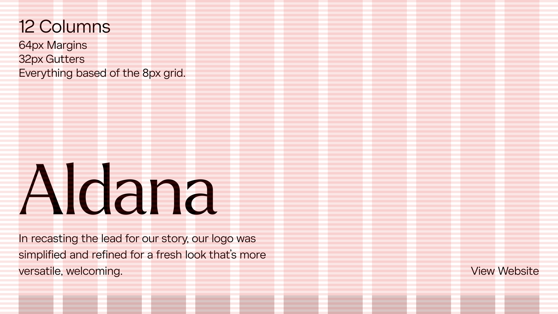
The website grid is a system for organizing the content on the page and creating alignment and order. It forms the basic structure or skeleton of your user interface. Designers use website grids to make design decisions and create a good user experience.